
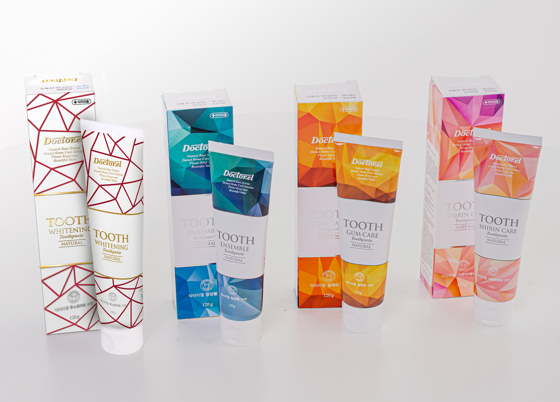
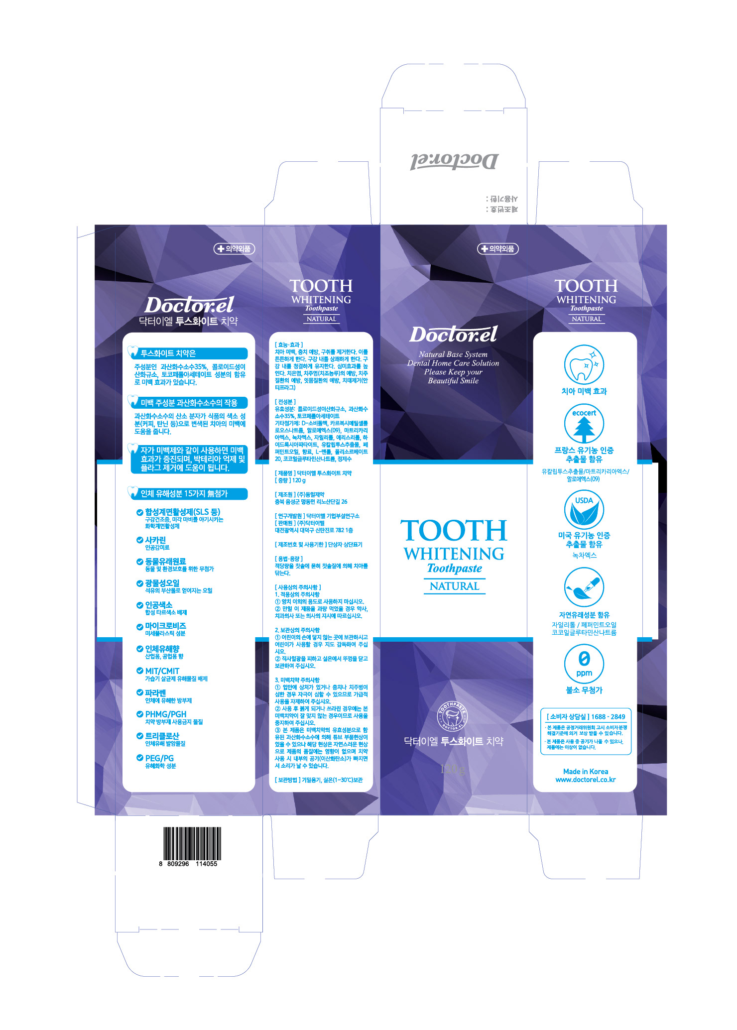
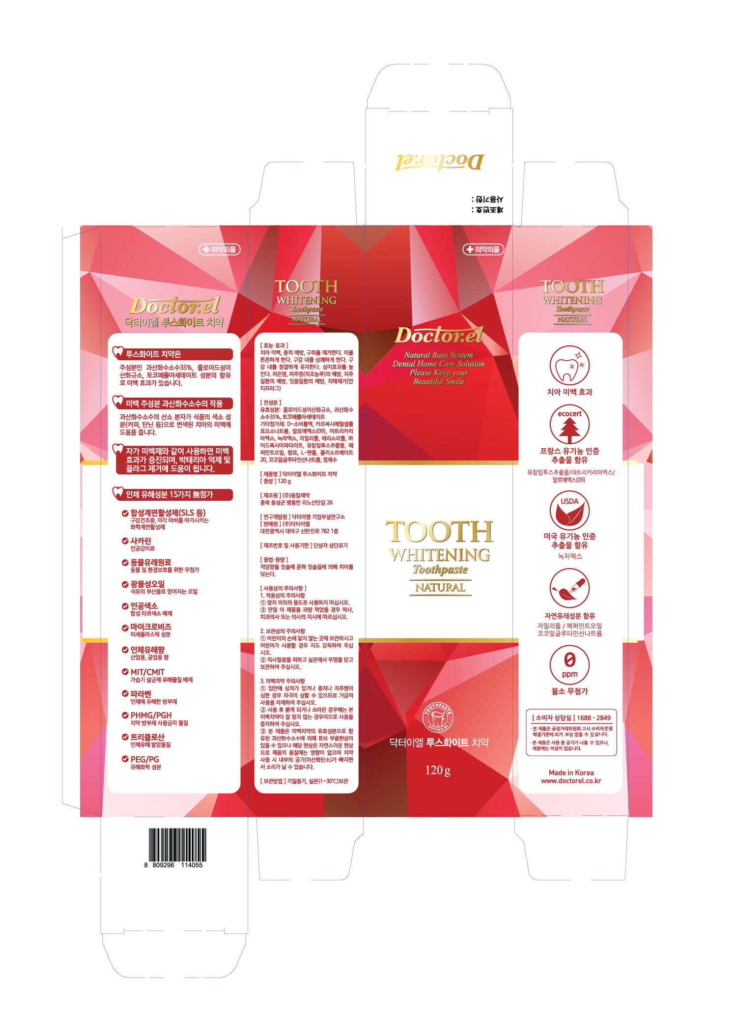
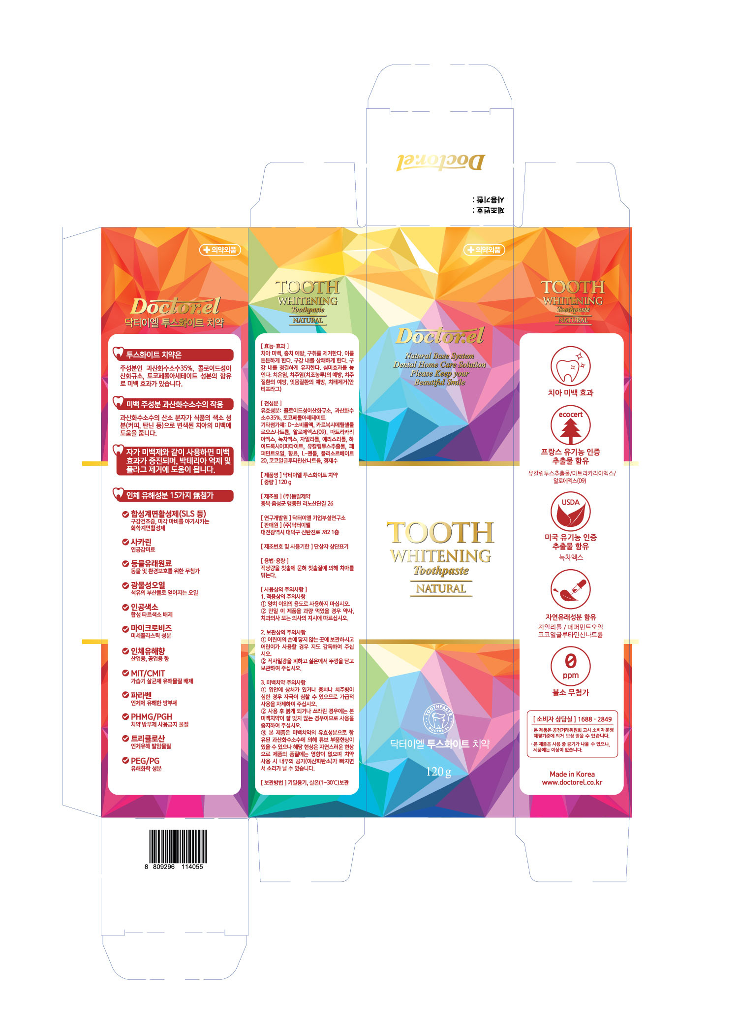
Toothpaste package redesign.
The goal is to update the design of the whitening toothpaste so that it does not stand out from the general product line, but is brighter and cleaner than the previous version.
It was decided to move away from colored polygonal options and settled on a linear design.
The goal is to update the design of the whitening toothpaste so that it does not stand out from the general product line, but is brighter and cleaner than the previous version.
It was decided to move away from colored polygonal options and settled on a linear design.

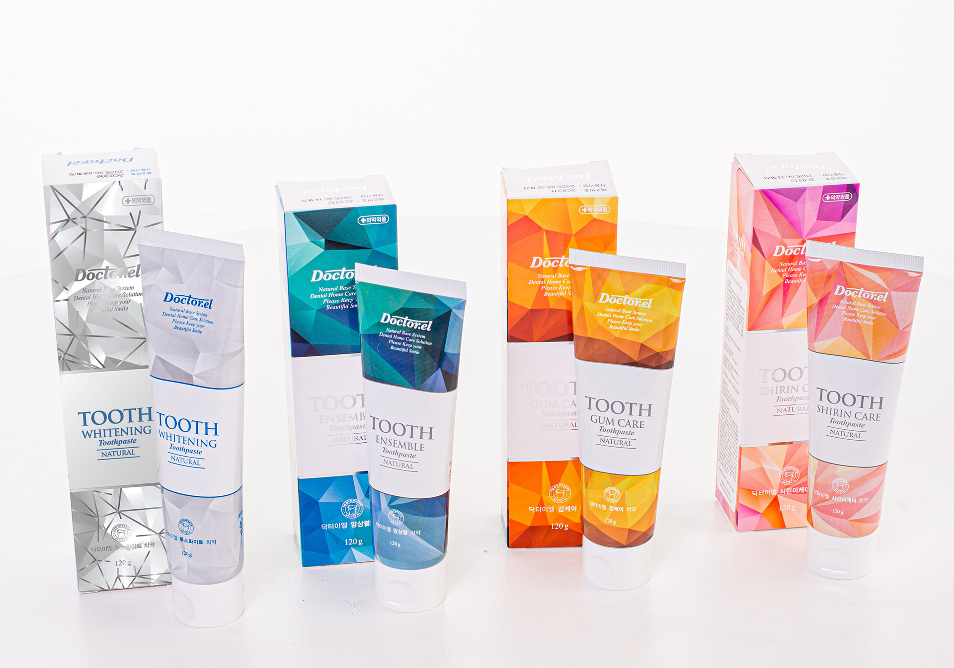
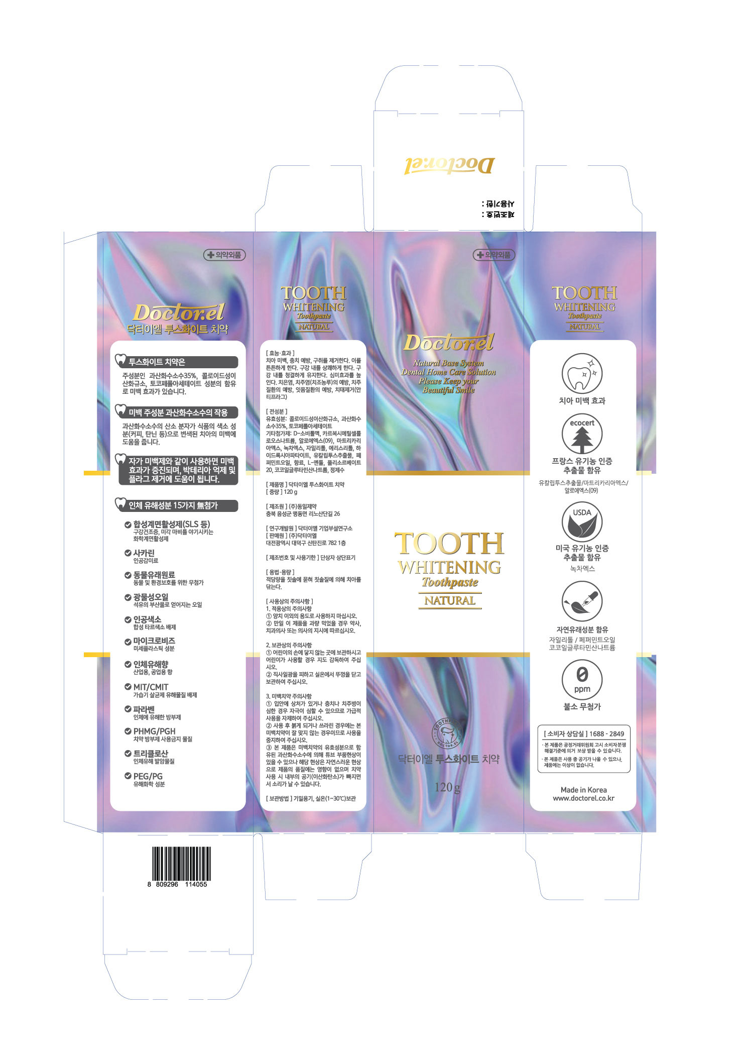
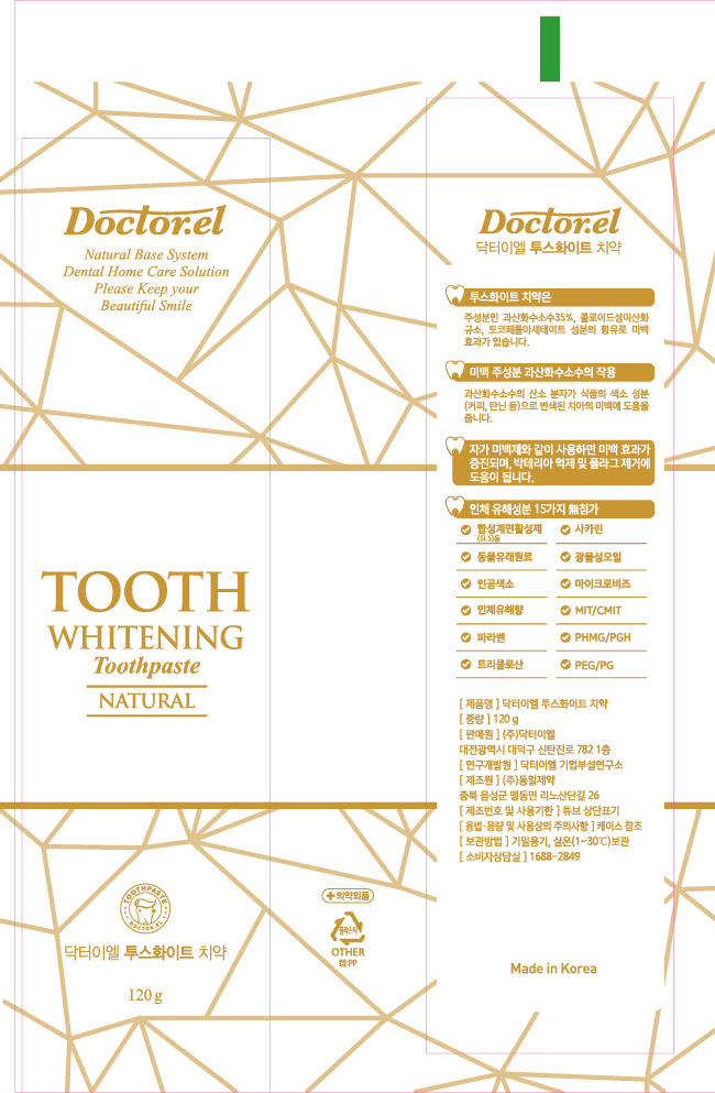
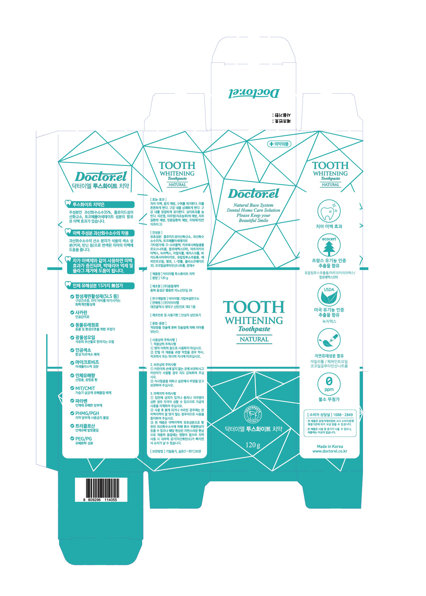
The second task is the same design on the box and on the tube. Due to technological problems it was decided to abandon the simplest design - embossing lines in silver on the box, as it was not possible to do it on the tube.
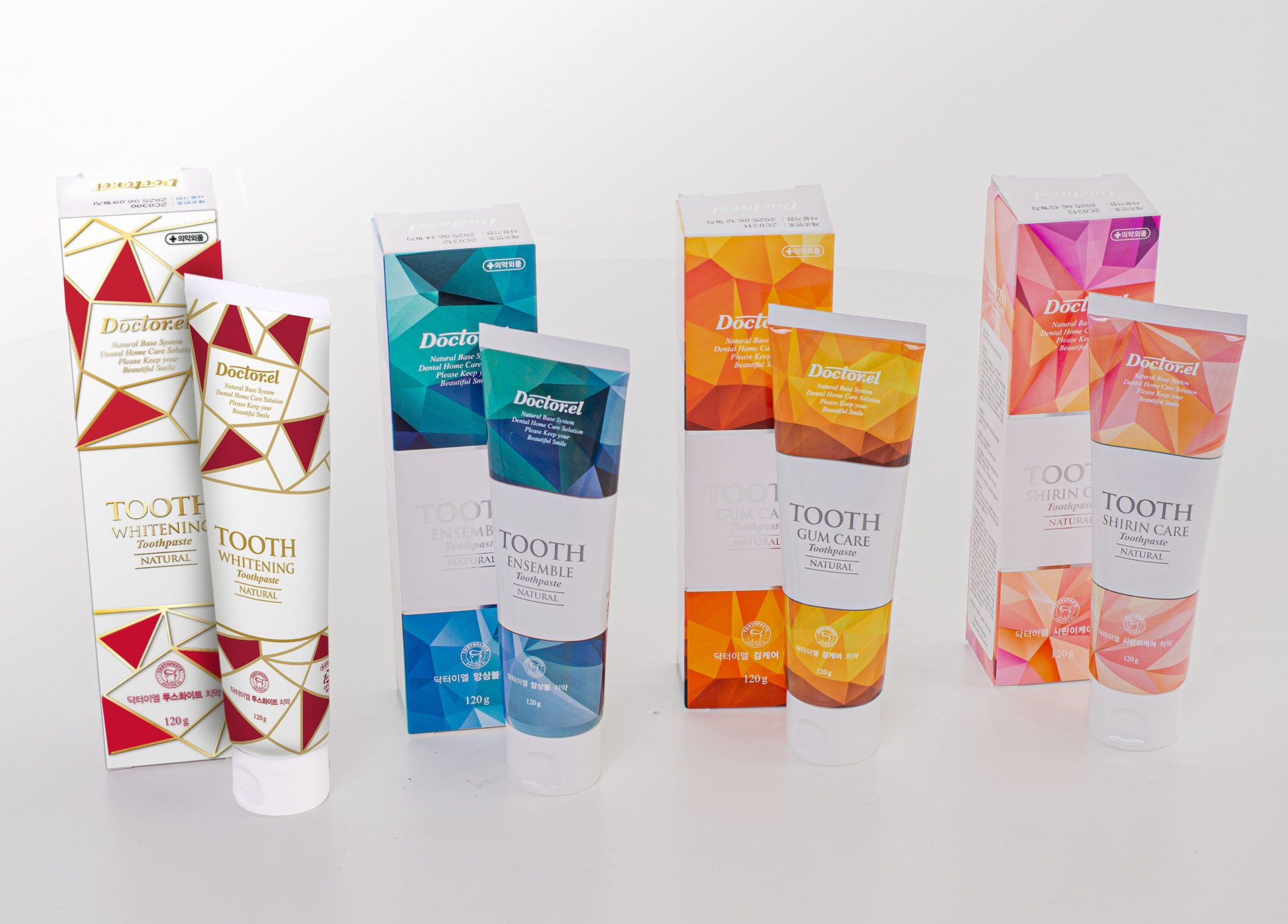
Together with the customer we decided to go with turquoise.
Together with the customer we decided to go with turquoise.